
Introduction
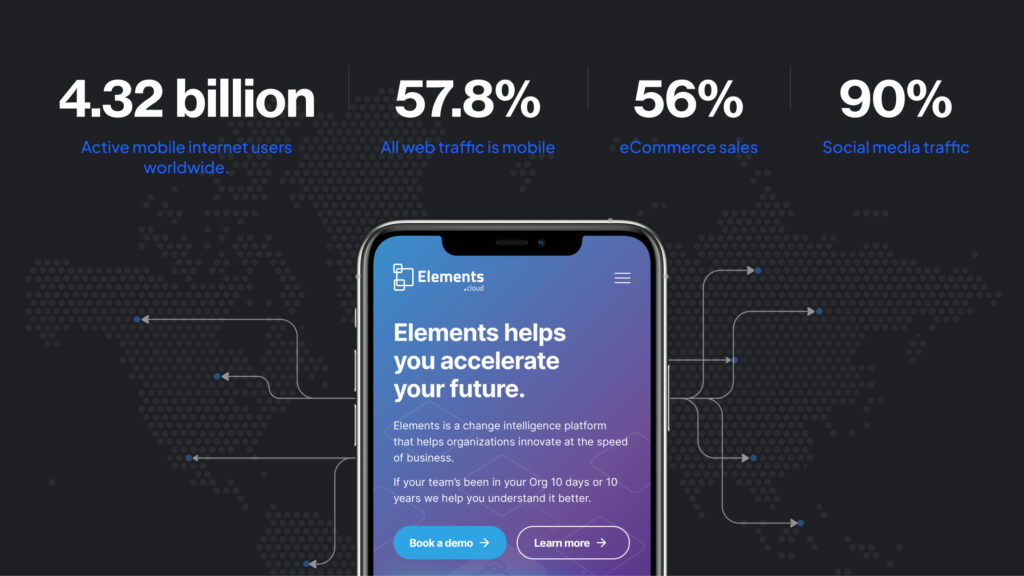
In today’s digital landscape, where mobile devices claim around a 58% share of web traffic, leveraging application development services with a mobile‑first mindset ensures your app or website not only looks great but also converts visitors into customers. A seamless experience on mobile devices is no longer an option, it’s a user expectation that can make or break your online presence.
Why the emphasis on mobile first? Consider this: your potential customers are likely accessing your website or web app from their smartphones or tablets. Ensuring that your content and features shine on smaller screens is paramount. Prioritising mobile user experience is a foundational step, ensuring that every touchpoint is intuitive and engaging.
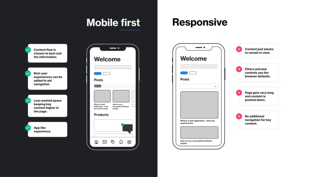
Responsive designs take this a step further. By dynamically adjusting your content to fit various screen sizes, your website becomes adaptable and accessible, regardless of the device. No more pinching or zooming – just smooth, effortless navigation.
Loading speed optimisation seals the deal. When patience is scarce, a slow-loading site can turn users away before they even get a taste of your offerings. Streamlining your website’s performance ensures a swift loading speed and keeps users engaged.
In the era of mobile devices reigning supreme, a mobile-first design isn’t just a trend, it’s a necessity. By embracing mobile-first practices, you’re not only catering to the majority of web traffic but also demonstrating your commitment to exceptional user experiences. You can ensure your digital presence thrives in the palm of your users’ hands. Let’s dive in.
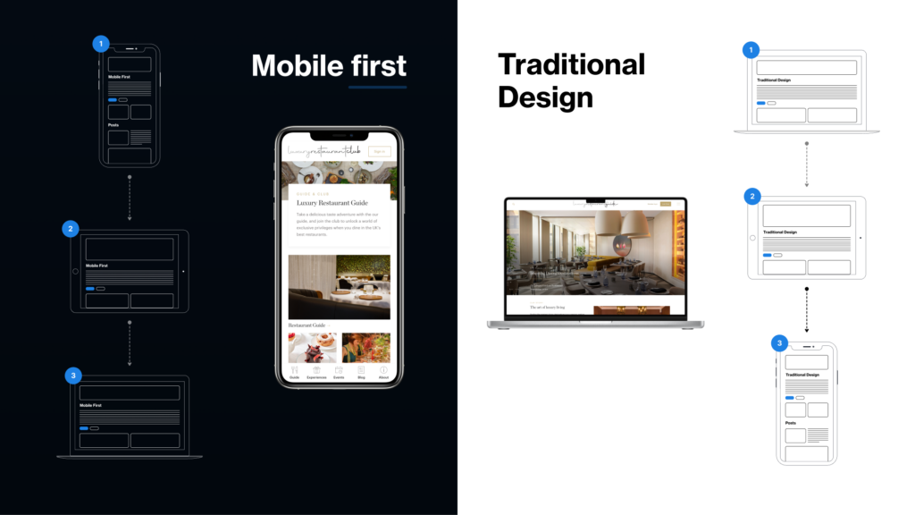
What is mobile-first design?
Mobile-first design does exactly what it says on the tin. Designing a website or app specifically for mobile devices, rather than for desktop.
Picture this: our web developers kick off the creative journey with mobile devices at the forefront. Why? Because starting with the mobile experience sets the stage for an intuitive and engaging interface.
Enter Responsive Web Design (RWD) and the dynamic duo of Progressive Advancements and Graceful Degradation. These strategies ensure that your platform flexes its muscles across devices, big or small. It’s like tailoring a bespoke suit for every screen, ensuring your users enjoy a flawless experience, no matter how they’re accessing your platform.
Responsive Web Design
Responsive Web Design (RWD) is a dynamic approach to web or app design, enabling pages to seamlessly adjust and conform to the distinct dimensions demanded by various devices.
This dynamic process extends to font sizes and element proportions, employing strategic breakpoints to ensure optimal readability and navigation across screens of all sizes. With the aid of a framework such as the Bootstrap framework, RWD encapsulates the essence of mobile-first design, efficiently condensing content for streamlined presentation on mobile devices.
By integrating RWD into design, the constant need for users to fiddle about panning, pinching, zooming and scrolling is remarkably reduced, enhancing the overall user experience.
Progressive enhancement and graceful degradation
Progressive enhancement and graceful degradation (or “responsive retrofitting”, as our Lead Designer Nik Bailey calls it) are pivotal principles within mobile-first design. They are opposite approaches to catering web experiences across an array of devices. Developers leverage these strategies to meticulously construct tailored iterations of web designs and application interfaces, building layouts that cater to the unique attributes of each platform and screen size. This strategic customisation ensures that the user journey remains seamless, intuitive and visually captivating, regardless of the device in hand.
- Progressive enhancement means developing a stable, robust and resilient frontend for a website – ensuring a useable experience for all users. For an excellent insight into this topic, check out the Gov.uk service design page
- Graceful degradation means developing a website or app for desktop first, then “degrading” features and functionality for a mobile version.
Why is mobile-first web design important?
Enhanced service and product discoverability on Search Engine Results Pages (SERPs), a powerful gateway to attracting more clients and an undeniable surge in online presence – that’s what’s up for grabs with a well-executed mobile-first website. As we speak, the tidal wave of mobile internet use and skyrocketing smartphone sales propels its importance into a new echelon. According too Statista, 63.5 million people in the UK in 2023 are mobile internet users. And with Google’s algorithm continuing to favour mobile-friendly websites, it’s not just a choice, it’s a mandate for success. Every pixel, every element, thoroughly tailored for the mobile experience. Businesses can thrive and prosper right in the palm of their customers’ hands. It’s a no brainer.
The more common approach now is to approach design and development from the mobile side first
Nik Bailey – Lead Designer, Lightflows
Content is key to a mobile-first design strategy
A content-first approach is a smart way to tackle mobile design. Content serves as the linchpin connecting user needs and design execution. Designers should prioritise essential elements over non-essential elements, to ensure a streamlined and uncluttered mobile experience.
If you have a responsive site, desktop and mobile content are very likely to be the same, but it is worth noting that desktop and mobile user needs are very different. On desktop, you have a larger screen on which to wax lyrical. On mobile, where screen real estate is limited, content must be concise, relevant and readily accessible. We utilise techniques including using carousels in place of grids of cards, accordions to collapse content and micro video to deliver a message in a multimedia format. It’s better to lead with mobile-first content and have users experience a more minimalist desktop page than the other way around.
Mobile-first design and accessibility
Mobile-first design and accessibility are like two close companions, working hand in hand to create a better user experience. A mobile-first design approach complements accessibility, which aims to make digital content usable for everyone, including people with disabilities.
For mobile, there are certain rules and recommendations that are already laid out, such as font and tap targets…….The limitations drive you to make something better.
Nik Bailey
By focusing on a mobile-first website, we naturally simplify things and make them easier to use, aligning with the goals of accessibility.
Let’s dive into the nitty-gritty. When we design mobile first, we start by making a list of all the content we want to include. This is our content inventory. Then, we figure out how to prioritise this content visually. We establish a hierarchy, where the most important information stands out and is easy to find. This is the visual hierarchy and acts like a roadmap for users, providing intuitive navigation that guides them through the information smoothly.
As we move beyond mobile, these principles stick with us. Whether it’s on a tablet or desktop, we want pages to be functional and look good. That means getting rid of unnecessary popups that disrupt the flow and focusing on quality. Extensive beta testing comes into play here, ensuring that everything works as intended before it goes live.
In the end, this partnership between mobile-first design and accessibility ensures that websites and apps are welcoming and easy to use for everyone. It’s all about simplifying, organising and making digital spaces a breeze to navigate.
Keep the user in mind
The user experience should be the starting point for all design. Its importance is only amplified for mobile first. When you think about how people interact with their phones – the physical experience, the touch, the grip, the haptics, the ease of scrolling, pressing buttons – it’s an immersive intuitive experience. In comparison, the physical experience of using a desktop is a lot more prescriptive, which often leads designers to start with content and a wireframe and consider the user experience after the fact.
Mobile-first design should begin with thorough research that delves into the intricacies of user behaviours, needs and pain points. This research is the compass guiding the design process, ensuring that every decision made resonates with the audience and addresses their challenges.
Research techniques include:
- Delving into your website analytics: If you have an existing site, understand how visitors are currently interacting with your site on mobile devices. Identify patterns such as frequently visited pages, bounce rates and conversion rates. This data provides insights into what’s working and what needs improvement.
- Competitor research: Investigate your competitors’ websites and apps, particularly their mobile-friendly solutions. Identify what works well and learn from their successes and shortcomings.
- User surveys: Directly engage with your website or app visitors through surveys or questionnaires. Ask about their experiences, pain points and suggestions to gather valuable insights.
- Usability testing: Conduct usability tests with real users to observe how they interact with your website or app. This provides first hand feedback on navigation, content and overall user experience.
Taking these steps can ensure you are creating a truly user-centred design.
Design phases of mobile-first design
The design phases of mobile-first design encompass a structured approach that ensures a seamless and effective user experience across devices. It’s a journey that begins with scrupulous planning and culminates in a harmonious design that transcends screen sizes.
- Content inventory: The foundation of mobile-first design lies in understanding and organising your content. We start by creating a comprehensive inventory of all the elements you want to include on your website. This step ensures that we prioritise essential content and streamline the user experience.
- Smallest breakpoints first: We embrace a bottom-up approach by designing for the smallest breakpoints first, typically targeting mobile devices. This technique compels you to focus on essential elements and forces you to make intentional design decisions that cater to the limited screen space.
- Wireframe for mobile: With a content inventory in hand, we create wireframes specifically tailored for mobile displays. Wireframes act as blueprints, outlining the layout and arrangement of content elements. This stage helps us visualise how users will interact with your website on small screens.
- Visual hierarchy management: Designing for a mobile version requires a keen understanding of visual hierarchy. Arrange content elements (such as fonts and font sizes for headings and paragraphs) in a way that guides users’ attention naturally, ensuring that crucial information takes precedence. This deliberate organisation enhances user comprehension and engagement.
- Progressive scaling: As we move to larger breakpoints, we expand upon the mobile design foundation. We gradually introduce additional content elements while maintaining the established visual hierarchy. This method ensures that the design remains coherent and optimised as it scales up to tablet and desktop displays.
The significance of these design phases is paramount. Mobile-first design demands a holistic approach that caters to user needs and preferences across a diverse range of devices. By systematically managing content, visual hierarchy and breakpoints, you lay the groundwork for a design that seamlessly adapts and resonates with users at every touchpoint. Ultimately, these phases harmonise to create a user experience that is not only intuitive but also engaging and consistent, regardless of the device.
Development phases of mobile-first design
The development phases of a mobile-first design strategy follow yet another structured path. Let’s walk through these phases step by step:
- Progressive scaling and visual hierarchy: As you move up the breakpoints (such as tablet and desktop), expand and adapt the wireframe while maintaining the established visual hierarchy. Pay close attention to the arrangement of content elements, ensuring that crucial information remains prominent. Strategic use of white space helps avoid clutter and enhances readability.
- Thumb-friendly elements: In a world where touch reigns, making elements thumb-friendly is essential. Design buttons, links and interactive elements with adequate spacing, allowing users to tap effortlessly without accidentally activating adjacent items. This practice enhances usability and minimises frustration.
- Avoid reliance on hover effects: Hover effects that work seamlessly on desktop can be problematic on touch devices. Since hover isn’t applicable to touchscreens, avoid relying solely on these effects for vital interactions. Consider alternative approaches, such as tap or swipe gestures, to ensure consistent functionality.
Best tools for mobile-first design
There are user-friendly several tools available that can assist in the mobile-first design process, such as Miro for user experience design andOctopus for creating sitemaps. If you need a helping hand, here’s a handy list of the best tools to use for mobile-first design:
- Google’s Mobile-Friendly Test: This tool allows you to test how easily a visitor can use your page on a mobile device. It analyses the URL and reports if the page has a mobile-friendly design.
- WebFlow and Framer.com: These user-friendly, no-code website builders can both be used for prototyping and launching mobile experiences. They offer a variety of templates and design elements that are optimised for mobile devices.
- Adaptive Images: This tool detects your visitor’s screen size and automatically creates, caches and delivers device-appropriate re-scaled versions of your web page’s embedded HTML images. This helps to improve page load speeds on mobile devices.
- Bootstrap: Bootstrap is a popular front-end framework that makes it easy to create responsive designs that are mobile first. It includes a variety of design elements and components that are optimised for mobile devices.
- PageSpeed Insights: This tool helps you improve web page speed across all devices and is handy for testing performance.
- WebPageTest: This performance product is an even easier to use version of the above, offering the additional ability to check the carbon footprint of your page.
UI frameworks and Design Systems
There are several top web UI and design systems in the industry that are widely used by designers and engineers when taking a mobile-first approach. Some of the most popular ones include:
- Google Material Design System: Material Design is a design system developed by Google that provides guidelines for creating intuitive and beautiful user interfaces. It includes a comprehensive set of design principles, components and tools that help designers create consistent and engaging user experiences across different platforms.
- Apple Human Interface Guidelines: Apple’s Human Interface Guidelines (HIG) provide a set of design principles and guidelines for creating apps and user interfaces for Apple’s platforms, including iOS, macOS, watchOS, and tvOS3. The HIG covers topics such as interface design, navigation, typography and accessibility, with specific recommendations for different devices.
- Microsoft Fluent Design System: The Fluent Design System is a design language developed by Microsoft that provides guidelines for the designs and interactions used within software designed for all Windows 10 devices and platforms. The system is based on five key components: light, depth, motion, material and scale.
- Atlassian Design System: Atlassian’s Design System is a collection of UI components, foundations and standards that help teams build beautiful product experiences. It includes design assets that map to the code libraries, enabling seamless handoff from design to development.
- Uber Design System: Uber’s Base design system was created to promote a centralised library of reusable UI components for designers and engineers. It provides a flexible and easy structure that helps designers get started quickly, with well-documented files for usage.
These web UI and design systems provide designers and engineers with the tools they need to create consistent and engaging user experiences across different platforms.
Wrapping up
Mobile-first design importance cannot be overstated. It holds the potential to redefine a business’ digital success. In a world where mobile devices dominate online interactions, not having a mobile-friendly presence equates to willingly turning away a significant portion of your potential audience. The impact is stark: without a mobile site, businesses risk a substantial audience loss, hampering reach and growth.
If we take a step back, the importance of understanding and catering to your target audience’s mobile browsing preferences cannot be overlooked. User behaviours vary across devices and a failure to consider these nuances can lead to frustration and disengagement. Recognising that your audience is increasingly mobile-centric highlights the critical role of mobile-first design. By prioritising mobile user experience, businesses tap into a thriving market, enriching engagement and bolstering their brand.
The key takeaway is clear: mobile-first design isn’t just a trend, it’s an imperative. It’s a transformative strategy that capitalises on the mobile revolution, enabling businesses to remain relevant, accessible and engaging in an increasingly mobile-centric world. By embracing this approach and tailoring experiences to the preferences of the target audience, businesses not only survive but thrive, forging stronger connections, broader reach and enduring success.
At Lightflows, we know this. So let’s create something extraordinary together.
FAQ’S
Mobile-first design is considered good practice for optimal user experience. Designing for mobile devices enables streamlined layouts and faster load times, enhancing user engagement. This approach aligns with the increasing use of mobile devices and search engine algorithms favouring mobile-friendly sites, leading to benefits such as improved discoverability in search and higher conversion rates.
Mobile-first design is widely regarded as superior to desktop-first design for several compelling reasons. It revolves around optimising the user experience on mobile platforms, acknowledging the prominence of mobile device usage in today’s digital landscape. By starting with mobile, designers ensure a seamless and intuitive experience, aligning with users’ expectations and behaviours.
One key advantage is the improved page load speeds inherent to mobile-first design. Mobile-optimised sites prioritise essential content, resulting in faster load times, reduced bounce rates and heightened user satisfaction. This approach enhances SEO optimisation, as search engines favour mobile-friendly sites, leading to better search rankings and increased visibility.
Focusing on a mobile-first approach also encourages the consideration of mobile devices’ limitations and unique features. By tailoring websites and applications specifically for mobile, designers create solutions that are efficient, responsive and tailored to the mobile users’ needs. In contrast, a desktop-first approach may lead to clunky mobile experiences and missed opportunities for engagement.
It’s a strategic and future-oriented approach that acknowledges the mobile-centric nature of today’s digital interactions, resulting in websites and applications that captivate, engage and succeed across diverse devices.
Mobile-first design is crucial for several reasons. It aligns with the growing number of mobile users, ensuring seamless interactions on the devices they use most. It prioritises user experience on phone and tablets by tailoring content and layouts, enhancing accessibility and engagement. It matches Google’s algorithm favour for mobile-friendly sites, improving SEO optimisation. This can lead to higher conversion rates as users find and engage with content more easily. In essence, mobile-first design optimises user experience, taps into a vast mobile audience and aligns with search engine algorithms for better discoverability and conversions.
Mobile-first design is of paramount importance due to the exponential growth of mobile users (63.5 million people in the UK in 2023 alone) and their evolving internet habits. As more individuals rely on mobile devices for online interactions, prioritising mobile first design becomes essential to cater to this expanding audience.
The Google algorithm further solidifies the significance of mobile-first design. It favours mobile-friendly websites, resulting in better search rankings. This directly impacts discoverability, ensuring that your content reaches a wider audience and enhancing the potential for conversions.
Mobile-first design also presents invaluable opportunities for accessibility. By focusing on mobile devices, designers inherently address key accessibility considerations, promoting inclusivity and ensuring that your digital offerings are usable by individuals with diverse abilities.
By embracing this approach, businesses tap into the immense potential of the mobile audience, fostering discoverability, conversions and a more inclusive digital presence.
