Did you know, based on a Stanford University study, 75% of consumers judge a business based on its website design? That’s why it’s vital to make informed decisions about all aspects of your brand, from logo design to typography.
Typography plays a huge role in shaping a brand’s identity, so when developing marketing sites, graphic designers must clearly understand what kind of message the brand wants to portray before handing it over to software developers.
That said, choosing typography is fun! With so many font styles available, they provide an opportunity to be creative and let your brand personality shine. If you want your customers to feel a certain way, typography can help set the tone of your business in just a few seconds which can, in turn, impact buying decisions.
This blog explores what typography is and why it’s so crucial in software development design. We discuss the different elements of typography and how these can impact how your customers perceive your brand. What’s more, we explain how we can help you choose the right typography for your business.
What is typography?
In short, typography refers to the art of arranging and manipulating the appearance of copy on a page. Typography aims to make content attractive and easy to read whilst reflecting the brand’s personality.
Why is typography important in digital branding?
Typography is vital in software development and brand management for many reasons. Below are just a few reasons you should consider investing in typography when rebranding.
Brand identity and brand experience
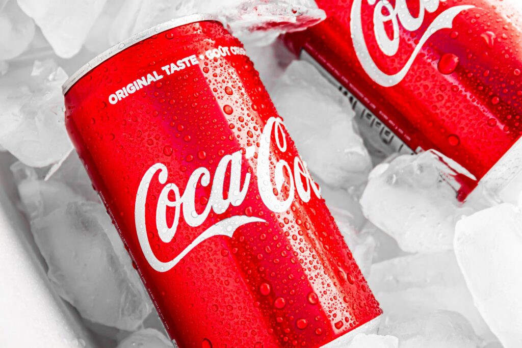
First and foremost, choosing the right font can impact and leave a lasting impression on your customer. Take Coca Cola, for example. What’s the first thing that comes to mind? If it’s not the colour red or a tasty fizzy drink, it’s probably their fancy typography. Since 1891, their infamous cursive font has remained because the brand has become so widely recognisable from the logo alone.
Likewise, when you think of a household name like Disney, not only might you picture the founder’s gorgeous handwriting, but it can create a wave of nostalgia. Whether it’s the first Disney movie you ever saw or that time when you went to Disneyland with your family, you can relive such fond memories just by looking at their logo.
From these examples alone, you can see how the right typography can create a unique brand experience. So, think of the journey you want to take your customer on. If you’re a restaurant chain, do you want them to imagine tasting one of your luxurious meals in one of your locations? If you’re a property developer, do you want them to imagine living in one of your new build homes? Once you’ve figured out where you want to take your customers, your fonts can help visualise their journey.
Brand management
Nowadays, though, fonts need to do more than just look good – they need to be legible. New technology means we have unlimited access to information, making consumers demand products and services whenever they want. Therefore, if your website’s typography is hard to read, it will put them off instantly.
According to a study by MDG, small font sizes and low contrast are the top design complaints about websites from consumers. If your brand creates a negative impression from the get-go, people will most likely not return. Easy-to-read font sizes and colours make all the difference in creating a positive brand image.
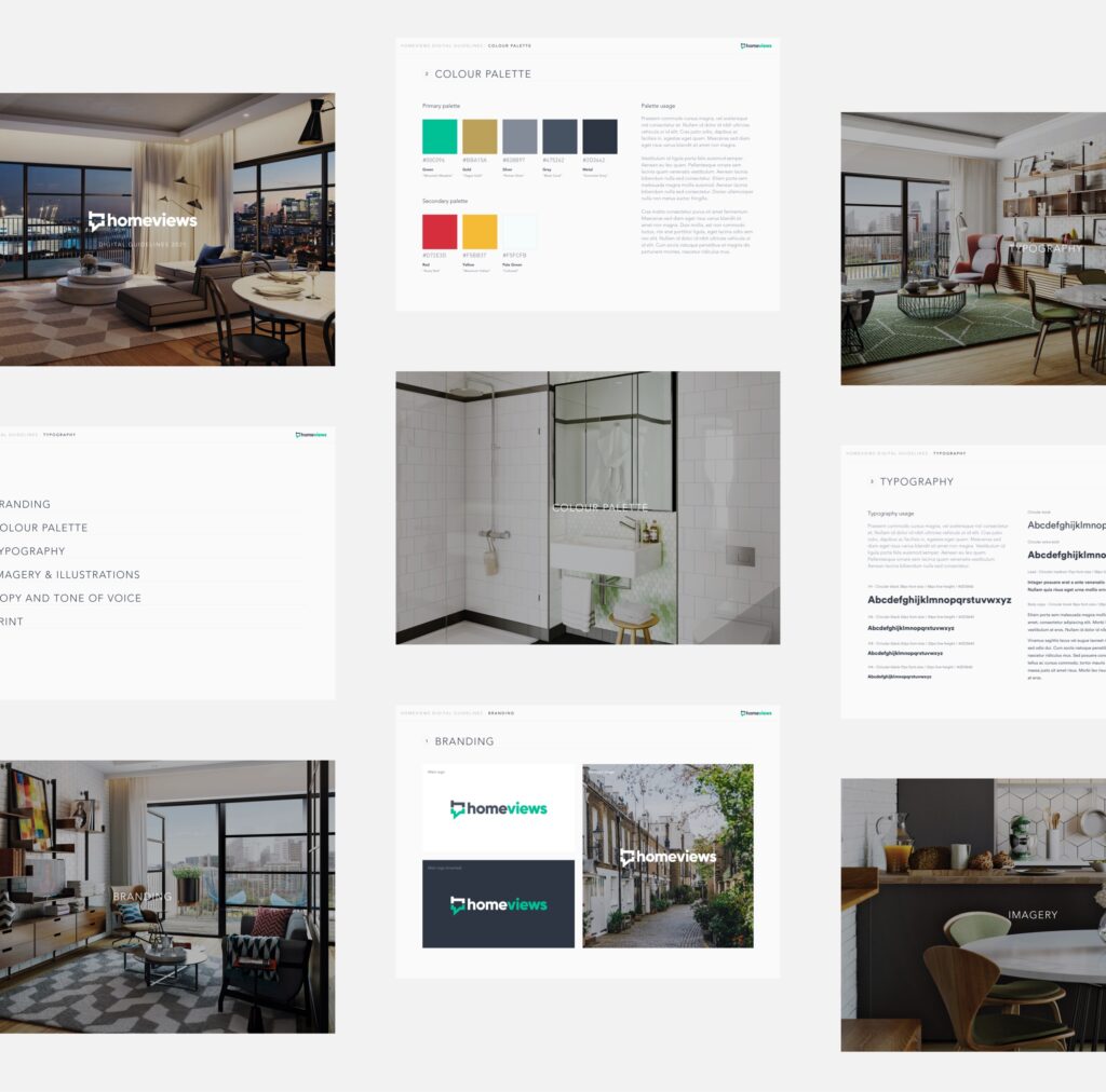
Unfortunately, many companies overlook the importance of typography and choose fonts that don’t work with their brand. Selecting a few fonts that align with your vision is essential to avoid confusing your target audience. Also, your employees will benefit from referring to these fonts to ensure consistency when creating content. As part of our digital branding services, we can build brand guidelines that will provide excellent brand management for years to come.
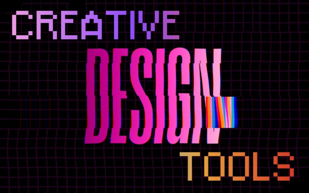
Elements of typography
There are many elements of typography to consider that can affect the perception of your brand. Considering the importance of creating a unique customer experience and providing strong brand management, we consider a few factors when reimagining brand identities.
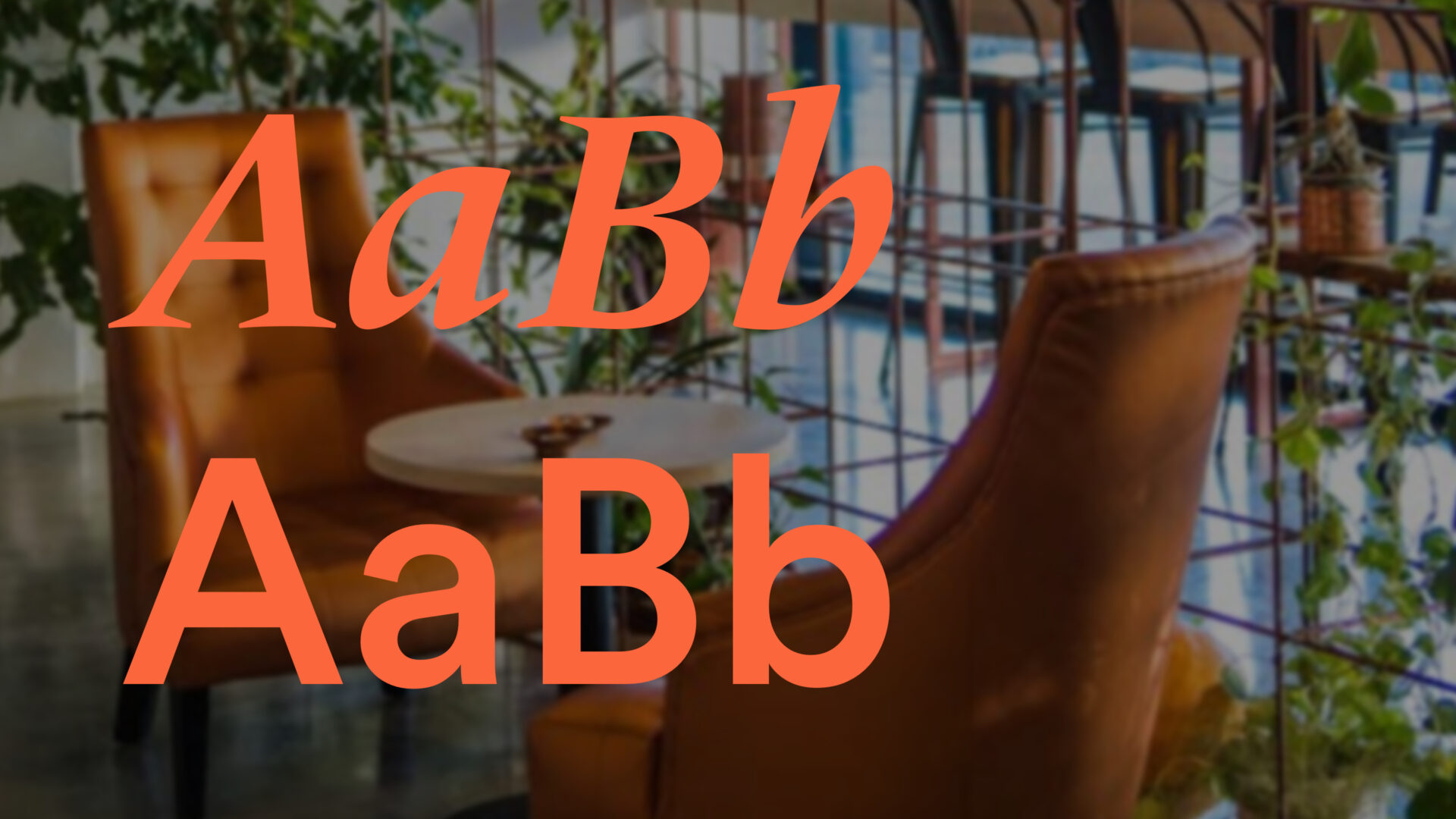
Typefaces and fonts
Although often used interchangeably, typefaces and fonts are different. A typeface refers to a specific lettering style that can vary in size, thickness and slope but shares a core design. Each variation of a typeface is known as a font.
For example, Arial, Helvetica and Calibri are all typefaces. Then, their variations, such as Arial Narrow, Helvetica Bold and Calibri Light, are all fonts.
Typefaces usually come in four kinds: serif, sans serif, script and decorative.
Serif fonts include those with decorative lines, also known as ‘tails’ or ‘feet’, while sans serif fonts don’t – hence the word ‘sans’ (‘without’). Script fonts have joined up letters to look like handwritten text. Finally, decorative fonts are self-explanatory; they have decorative embellishments, typically used in titles or headings to make the text pop.
Usually, a skilled graphic designer will pair serif and sans serif fonts and keep decorative fonts to a minimum to create a seamless user experience.
Font size
In typography, size refers to the height of a single character, measured in points (pt). Choosing the right font size is fundamental to increasing readability, as too small a font size makes your copy hard to read. The minimum recommended size for body text is 16pt, although 17pt-18pt is quickly becoming the preferred size among web designers.
Font colour
When it comes to typography, picking the right colours is essential in conveying the tone you wish to set whilst catering to all readability levels. However, users will quickly give up trying to read your content if it is too hard to make out. Therefore, if your company logo includes light colours, consider choosing darker ones that complement them for your copy.
With Lightflows’ branding services, we can define your company image by creating a set of brand guidelines, including selecting appropriate colours, to help standardise your content and enhance accessibility.
Text alignment
Alignment concerns arranging the edges of the copy to the edge of a page or the text box it sits within. The four types of alignment are left, right, centred and justified. The most common alignment on a web page is left alignment since it results in much better readability.
White space around text
White space, also known as ‘tracking’ or ‘line spacing’, relates to spacing out letters in words or lines of text. Too much or too little white space can make text difficult to read. We recommend aiming for line spacing of 150%, or 1.5 times, your selected font size.
Hierarchy
Hierarchy in typography helps create a clear distinction between prominent pieces of text and standard text. For example, in the case of this blog, we have used primary headings, secondary headings and body text to make the content more digestible.
In graphic design, a current trend is eyebrow text – a short phrase placed above a main heading and body text to summarise the text. Eyebrow text is a great way to make your copy look more aesthetically pleasing whilst conveying a quick message.
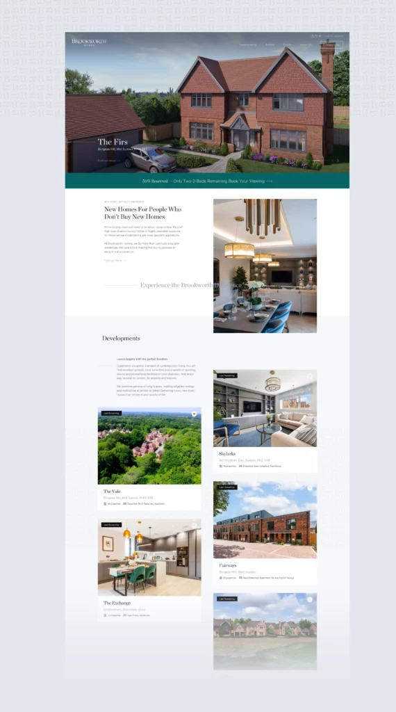
Below is an example of how we used hierarchies and eyebrow text for our client Brookworth Homes. As you can see, it captures your attention whilst fitting with the brand’s luxury tone.
Enquire about Lightflows software development services
Typography is a crucial element of rebranding in software development. But, as this blog shows, it can be pretty tricky to master. If you’re struggling to choose the right typography for your business, consider consulting a specialist software development company like Lightflows. We will carefully assess your brand and suggest fonts in line with your company goals, target market and consumer expectations. Get in touch so we can get started on creating your unique software experience.